
Design 02 of 13 · Bold and lively
Fixture
Bold lettering and a fixture-list layout.
Use this styleSee it live (opens in a new tab)Shown on a real club’s content
1 of 4 The first screen
The idea
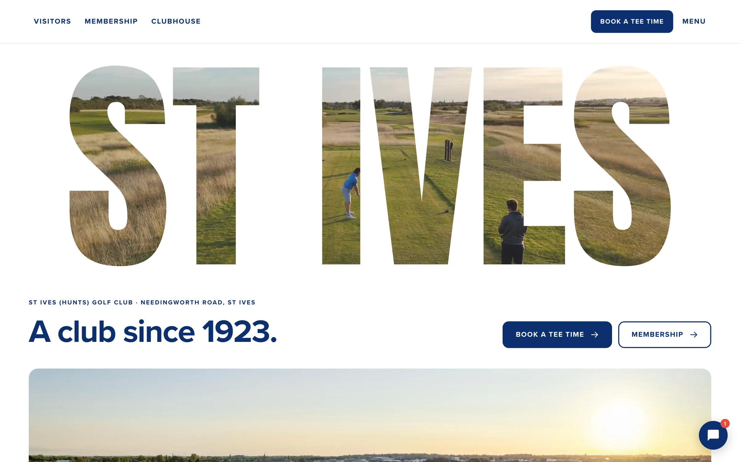
A bold, energetic homepage with your club's name across the full width and your course film showing through the letters. Everything the club offers is set out like a fixture list, each with its own button.
- Best for
- A club with a busy calendar that wants energy, bold type and a younger feel.
- Inspired by
- The websites of host cities for major football tournaments: big lettering, bold colour and fixture-list layouts.
What it does
- Your club's name across the full width with the course film showing through the letters, shrinking into the header as you scroll.
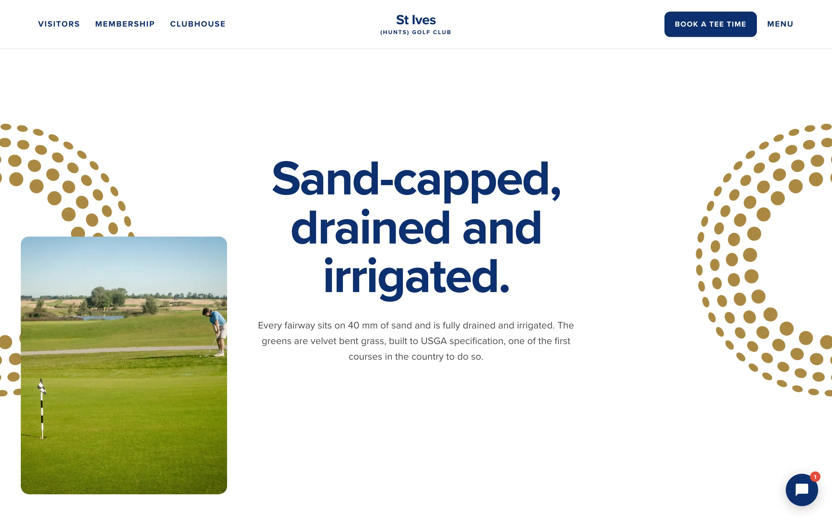
- A line about how your course is built, with golf-ball dimple patterns and photographs rising beside it.
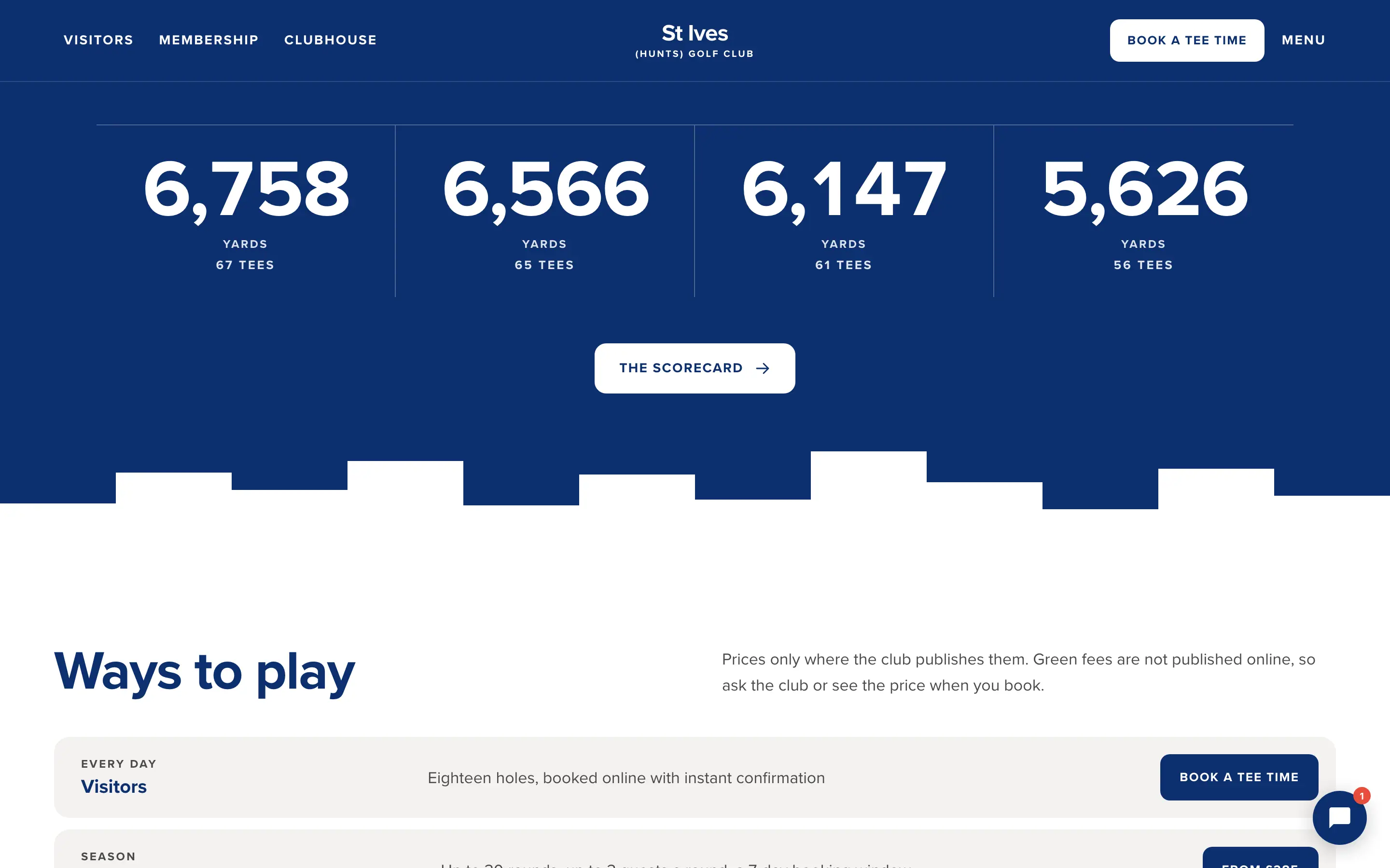
- Your tees as big yardage numbers.
- Ways to play, such as visitors, membership, coaching, societies and weddings, set out as a fixture list, each with a button.
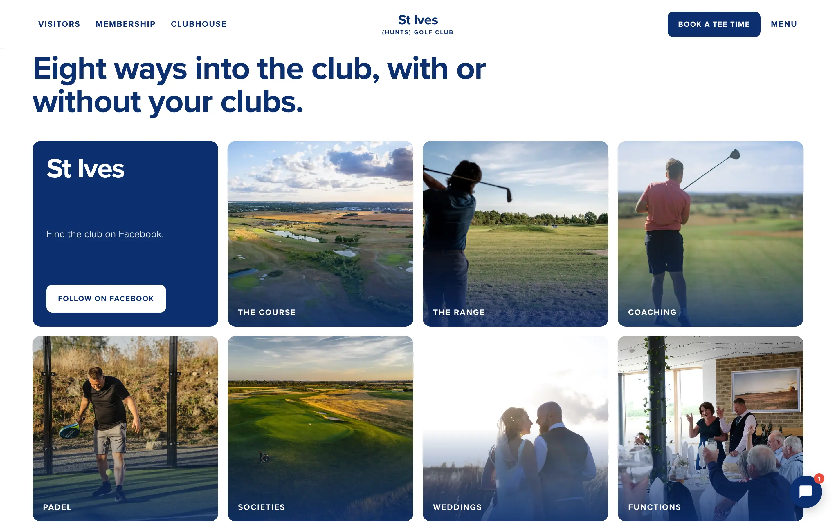
- Every way into the club in a photograph grid.
- Call us, or book online: every way to get in touch in one panel.
Like Fixture? See it on your club, free.
We redesign your homepage in Fixture, with your own content, and send you a private link within two working days. No obligation.
Use this styleSee it live (opens in a new tab)Shown on a real club’s content